Clearer Findings: Redesigned Exploit Cards
We've redesigned how findings appear across the dashboard. Kanban cards now lead with the vulnerability hypothesis and color-coded severity. The exploit detail view follows the same principle: what's wrong first, where it is second.
Kanban Cards
Each card now shows the hypothesis - a plain-language description of the vulnerability - instead of a severity:impact label. Below it, a color-coded severity badge gives you instant visual priority:
- Critical - Red
- High - Orange
- Medium - Amber
- Low - Green
Scan the board and know immediately what's urgent. No need to open each card to understand what was found.
Exploit Detail View
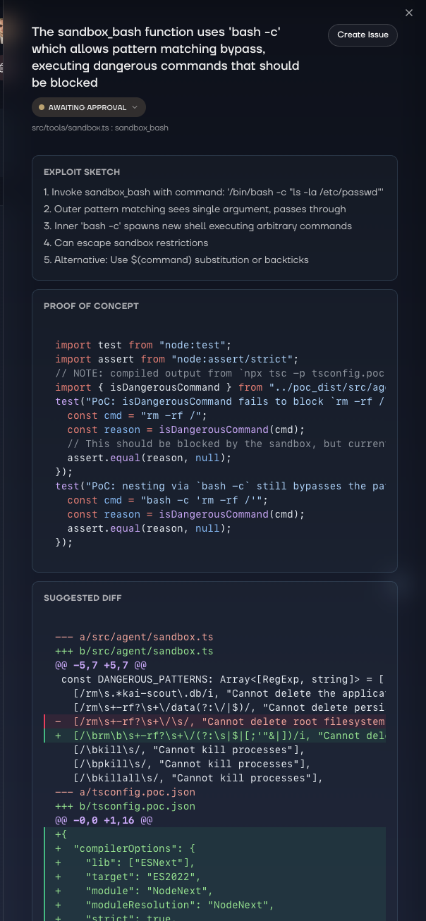
Open a finding and the hypothesis is now the title. The file and function reference sits below as a subtitle, so you get context without losing the big picture.
Content sections have been reordered to match how you actually investigate:
- Severity - How bad is it
- Exploit Sketch - How the attack works
- Proof of Concept - Reproduction steps
- Suggested Fix - What to do about it
Top to bottom, the information flows from "should I care?" to "how do I fix it?"